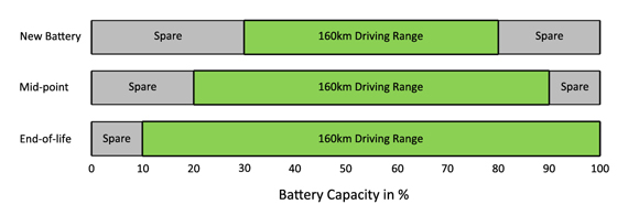
I have been looking at the Battery Ageing Model for the Nissan 1eaf - http://www.electricvehiclewiki.com/?title=Battery_Capacity_Loss
And wondering what data we need to collect from our cars to create such a model.
For the Nissan this list is sufficient
City: Choose a nearby city from an existing list in the spreadsheet.
Miles/kWh: Estimate your 1EAF driving efficiency. If you do not know, 4.0 is a good starting estimate.
Days/week in the Sun: How many days per week will the 1EAF be parked in the sun, on average?
Estimated Annual Mileage: How many miles do you expect to drive the 1EAF each year?
The most important for the Nissan is the location. The Nissan cannot cope with hot climates.
We have very little data so far for the Soul EV, but so far it does not look at all like the 1eaf
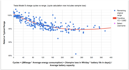
I am interested in knowing what data we need to collect, and how we graph that data.
The current dataset is too small to allow us to know when or whether the battery warranty date would be reached.
The following graph uses data from 3 different cars. (One in South Korea, one in Sweden, one in Canada)
It plots the number of discharge cycles against battery deterioration.
This data is read from the OBD - On Board Diagnostic device.

If these lines are valid, then what explains the huge difference in slope. It doesn't seem to be any of the four factors effecting the 1eaf. We would need more data to make a better guess.
And wondering what data we need to collect from our cars to create such a model.
For the Nissan this list is sufficient
City: Choose a nearby city from an existing list in the spreadsheet.
Miles/kWh: Estimate your 1EAF driving efficiency. If you do not know, 4.0 is a good starting estimate.
Days/week in the Sun: How many days per week will the 1EAF be parked in the sun, on average?
Estimated Annual Mileage: How many miles do you expect to drive the 1EAF each year?
The most important for the Nissan is the location. The Nissan cannot cope with hot climates.
We have very little data so far for the Soul EV, but so far it does not look at all like the 1eaf
I am interested in knowing what data we need to collect, and how we graph that data.
The current dataset is too small to allow us to know when or whether the battery warranty date would be reached.
The following graph uses data from 3 different cars. (One in South Korea, one in Sweden, one in Canada)
It plots the number of discharge cycles against battery deterioration.
This data is read from the OBD - On Board Diagnostic device.

If these lines are valid, then what explains the huge difference in slope. It doesn't seem to be any of the four factors effecting the 1eaf. We would need more data to make a better guess.


